*Not affiliated with the official Trader Joe’s brand*
Trader Joe’s Packaging Design
As part of my Senior Thesis, I designed packaging for existing and fictional Trader Joe’s products to align with the companies brand guidelines, core values and overall presentation
THE WHY?
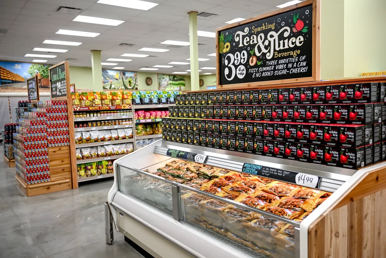
As a Trader Joe's employee for over three years, I've always been drawn to the packaging — the bold colors and playful illustrations are often what catch a customer's eye first. Noticing how much of the packaging felt outdated inspired me to explore how I could contribute to that visual identity myself. Trader Joe's brand is colorful, quirky, and full of personality, and I wanted my redesign to feel like a natural extension of that voice.
THE RESEARCH
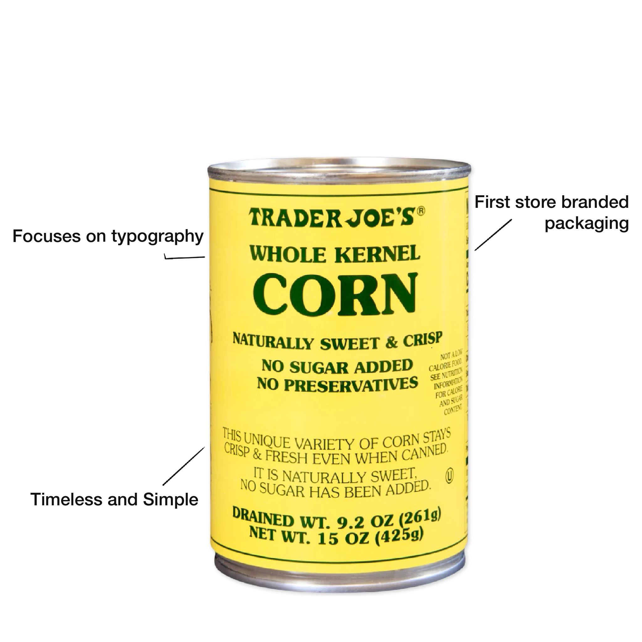
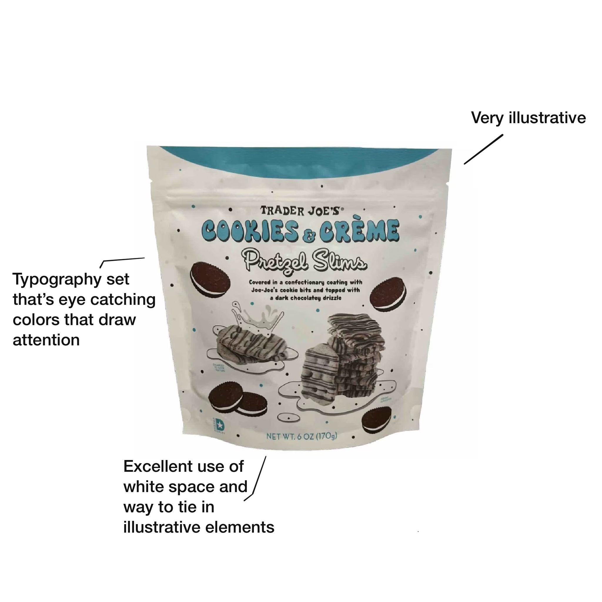
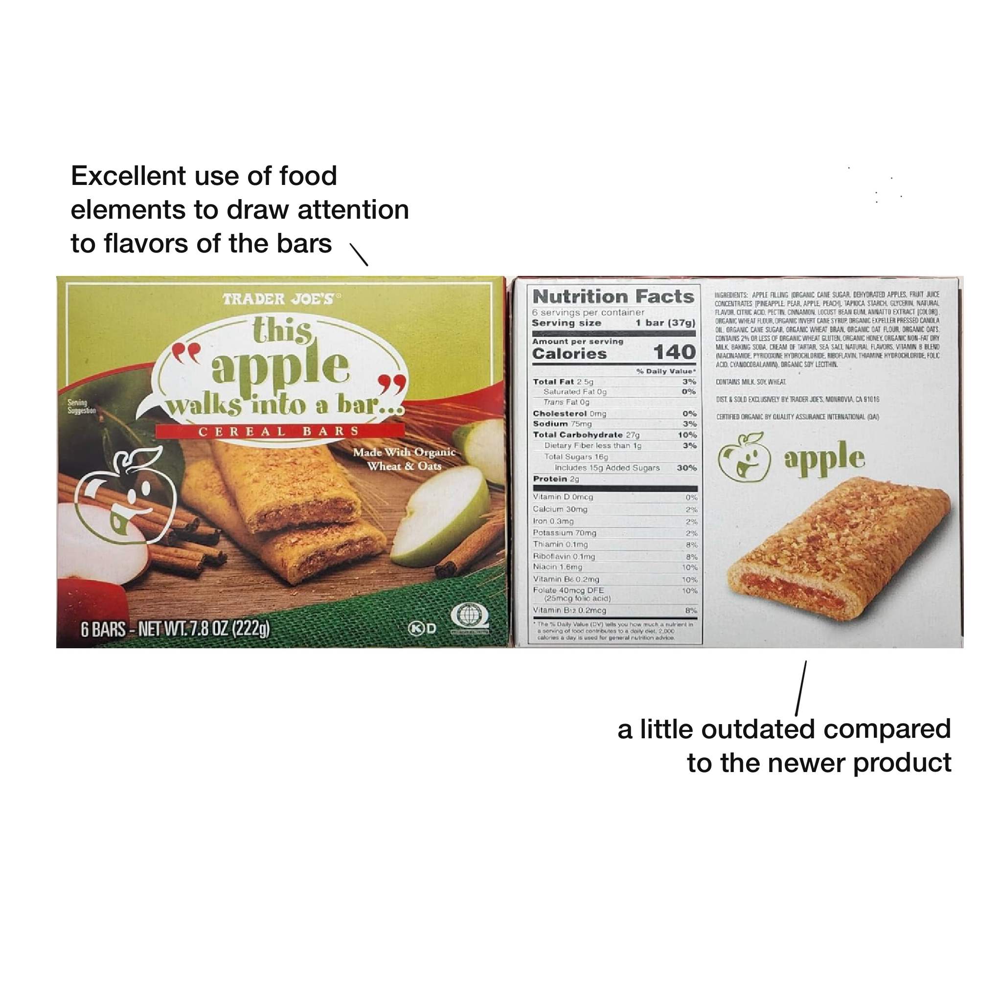
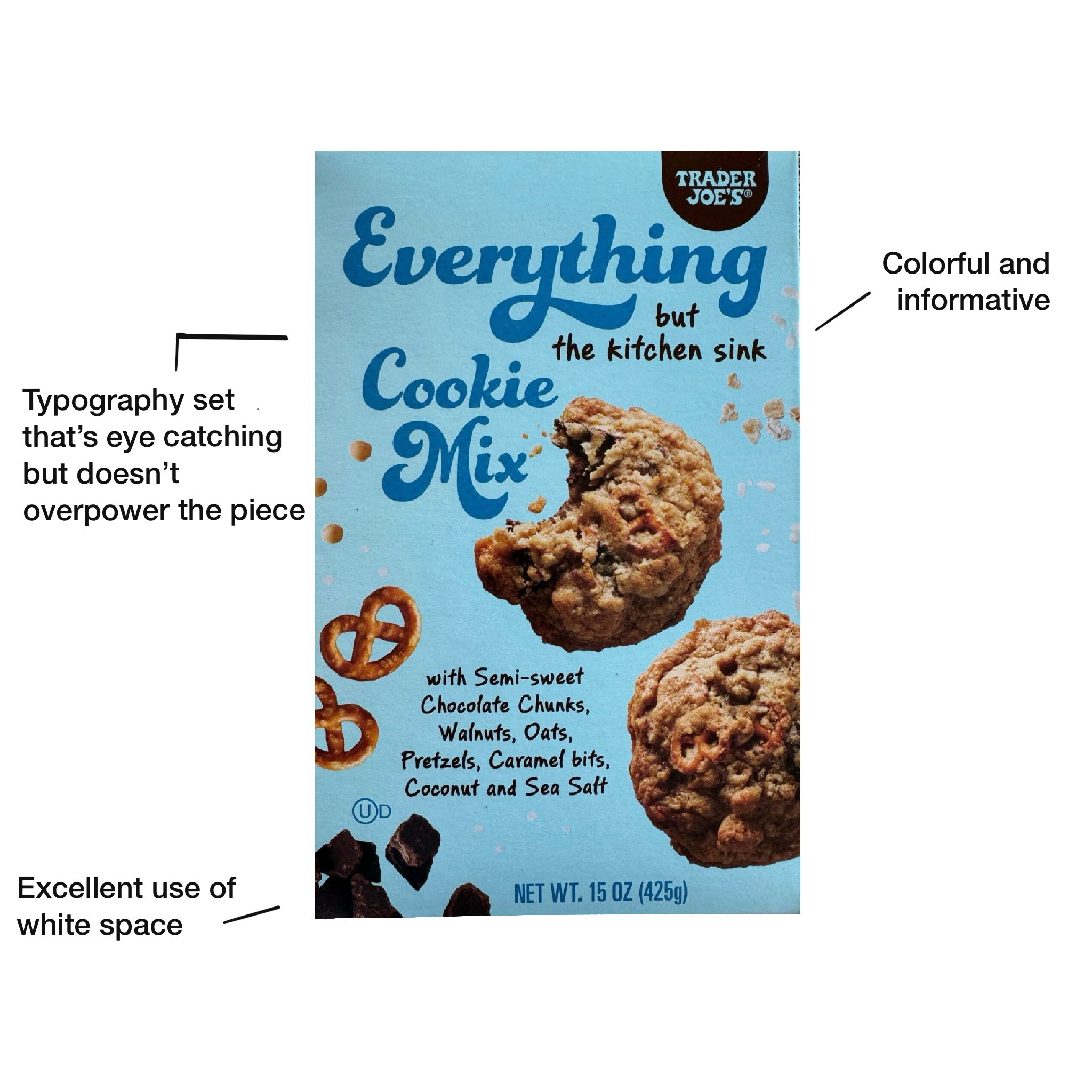
My research began with a deep dive into Trader Joe's existing packaging across product categories, paying close attention to typography, color usage, and illustration style. I studied how their hand-lettered and quirky type choices worked together with bold, saturated colors to create a distinct, playful shelf presence. From there, I focused on identifying the visual "rules" that made the brand feel cohesive so I could apply that same logic to my own designs and keep them feeling authentically Trader Joe's.
Trader Joe’s specifically uses distinct packaging for their products to make it seem as if each box has it’s own personality. It’s to take away the mundaneness of store packaging with the exact same templates.
Alongside the visual research, I also studied Trader Joe's target audience; value-conscious, curious shoppers drawn to unique, high-quality products with a sense of humor and approachability. Understanding who I was designing for shaped decisions throughout the project, from the tone of the copy to how playful or restrained certain illustrations needed to be. This was to ensuring the packaging wouldn't just look on-brand, but actually resonate with the people picking it up off the shelf.
THE RESULTS
-
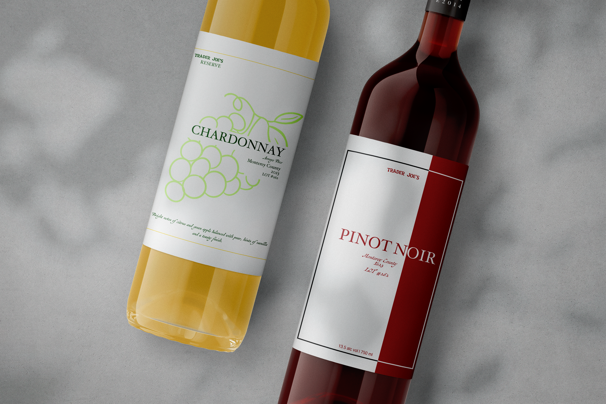
![Wine Labels]()
Wine Labels
-
![]()
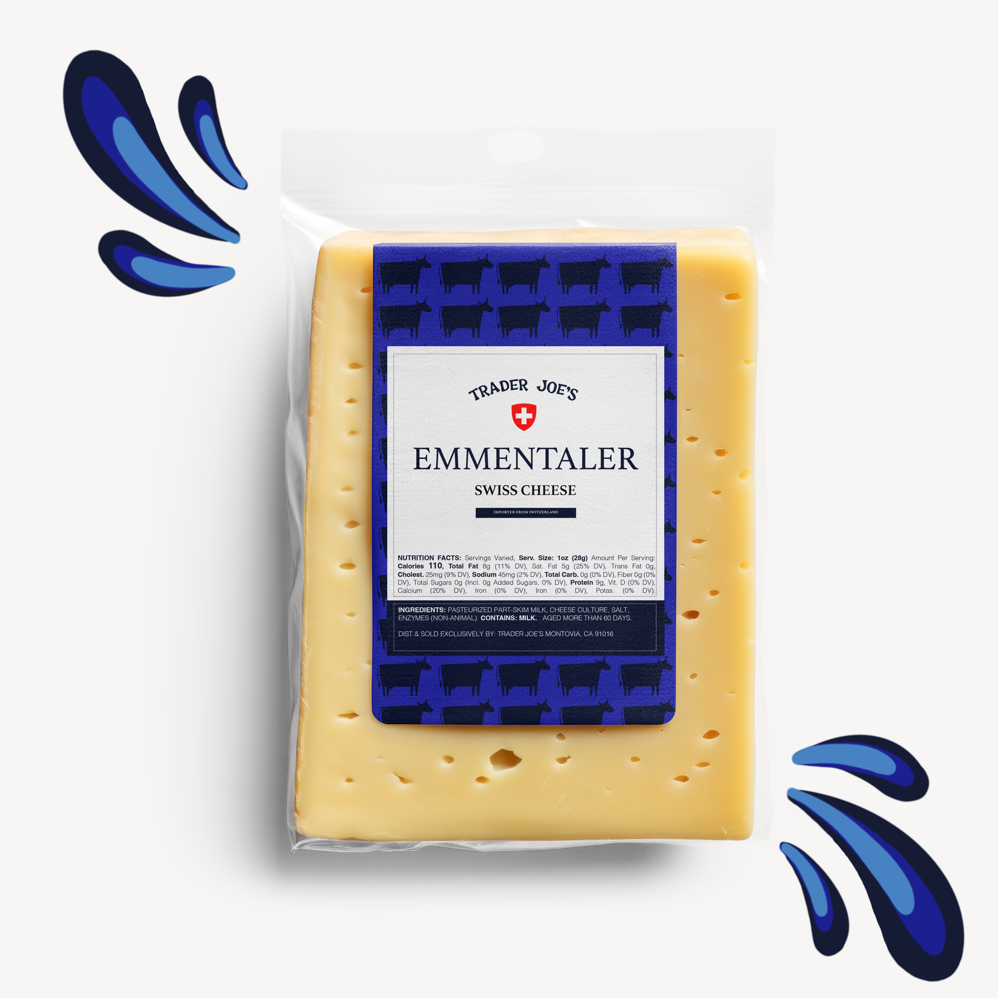
Emmentaler Cheese
-
![]()
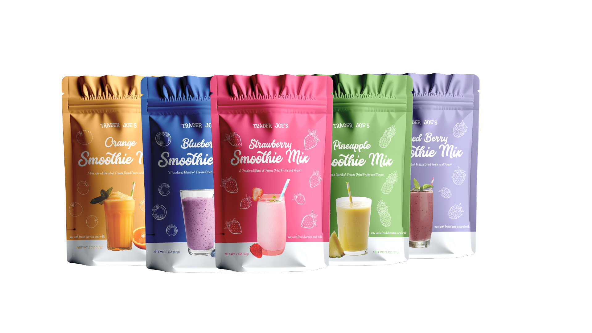
Smoothie Mixes
-
![]()
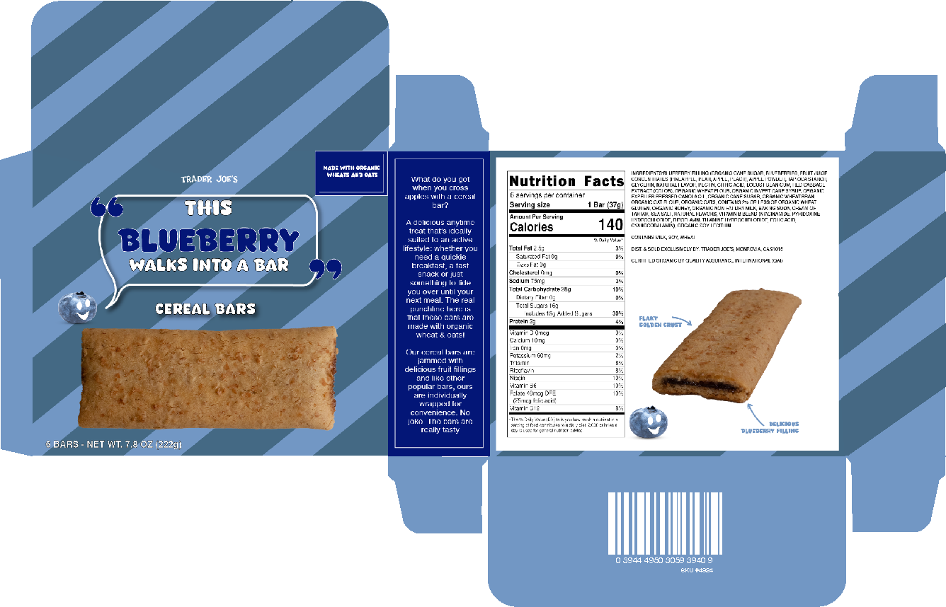
Blueberry Breakfast Bar
-
![]()
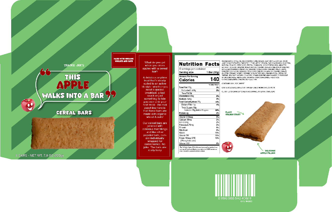
Apple Breakfast Bar
-
![]()
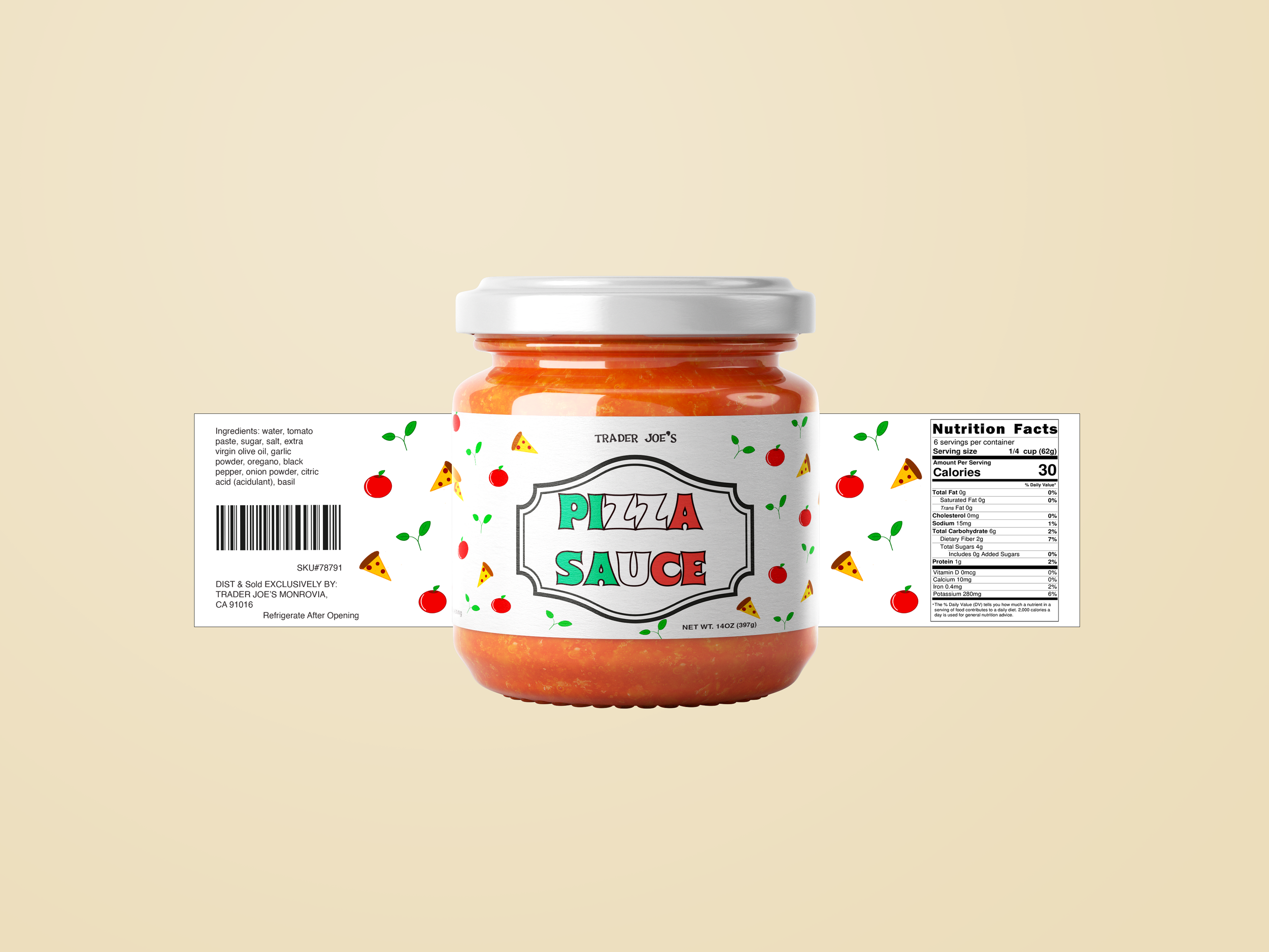
Pizza Sauce
-
![]()
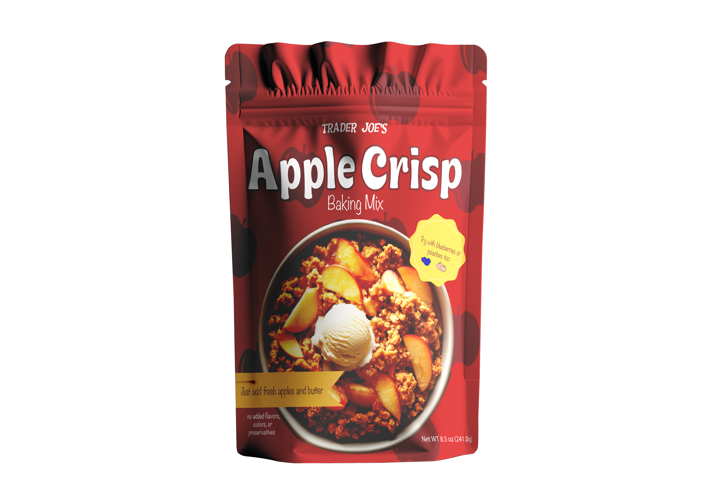
Apple Crisp
THE TAKE-A-WAY
I was incredibly fortunate to connect with senior designers at Trader Joe's corporate, whose feedback became a valuable guide throughout the entire thesis process and continues to shape how I design today. Much of my early work leaned heavily on illustration, and their insight pushed me to shift focus toward typography which created a more balanced, refined look that better served the packaging's clarity and shelf presence. Through that process, I learned an enormous amount about design, typography, and color in the context of a real, industry-informed project.